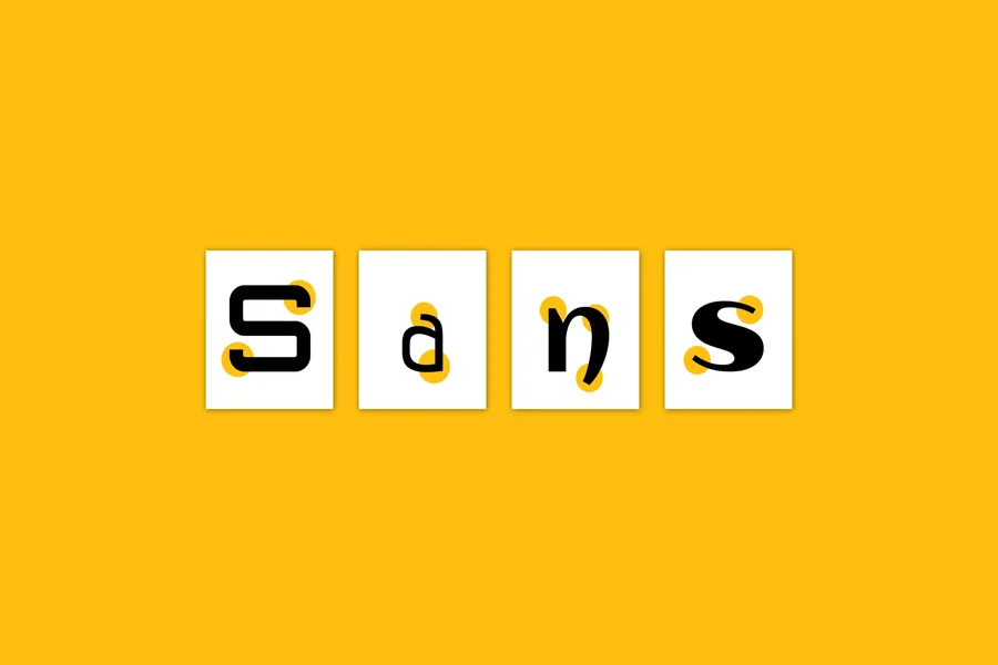
One of the most popular font categories in modern design is sans serif. Unlike serif fonts, which have small decorative lines (serifs) at the ends of strokes, sans serif fonts are clean, simple, and free of embellishments. Their sleek and modern appearance makes them a go-to choice for a wide range of applications. But what makes sans serif fonts so effective? Below, we explore the key benefits of using sans serif fonts in design and communication.
Enhanced Readability on Screens
One of the biggest advantages of sans serif fonts is their readability on digital screens. With the rapid shift toward online content consumption. Whether through websites, mobile apps, or social media, clarity is more important than ever. Sans serif fonts and Open Sans maintain clean lines and consistent shapes that scale well across various screen sizes and resolutions.
The lack of serifs means there is less visual clutter, especially at smaller font sizes. This makes sans serif fonts ideal for body text in digital environments, where legibility can often be compromised by low screen quality or poor lighting conditions.
Modern and Minimalist Aesthetic
Sans serif fonts are often associated with modernity and simplicity. Their geometric structure and clean edges contribute to a contemporary, uncluttered look that aligns well with current design trends. Brands looking to convey innovation, efficiency, and forward-thinking values often opt for sans serif fonts in their logos and marketing materials.
This aesthetic is particularly valuable in sectors such as technology, fashion, and design, where sleek and minimal visuals are key to brand identity. Sans serif fonts offer a professional yet approachable tone, making them suitable for both corporate and casual contexts.
Versatility Across Media
Sans serif fonts are extremely versatile and can be used effectively across different types of media, from printed materials to digital interfaces. Their simplicity allows them to pair well with more decorative typefaces or to stand alone in minimalist designs. Whether you’re designing a business card, an infographic, or a mobile app interface, sans serif fonts provide a flexible solution that maintains consistency and coherence.
Because of their neutrality, sans serif fonts are also excellent for multilingual content and user interfaces, where clarity and neutrality are essential for a global audience.
Better Accessibility
Accessibility in design is more than a trend, it’s a necessity. Sans serif fonts are generally considered more accessible to individuals with visual impairments or reading disorders such as dyslexia. Their clear and consistent shapes reduce ambiguity between letters (such as “I”, “l”, and “1”) that can often be confused in more ornate serif fonts.
Additionally, the absence of complex details allows screen readers and other assistive technologies to interpret and display text more effectively. For designers and developers aiming to create inclusive digital experiences, sans serif fonts are a smart choice.
Cleaner Typography for Branding and Advertising
In branding and advertising, first impressions matter. Sans serif fonts offer a bold, straightforward presence that can convey strength, clarity, and confidence. This is particularly important in logo design and advertising copy, where quick readability and visual impact are essential.
Many of the world’s most recognizable brands use sans serif fonts in their branding to project a modern, user-friendly image. Their widespread use in corporate identity also helps create a sense of familiarity and trust among consumers.
Conclusion
The benefits of using sans serif fonts are numerous, particularly in a world that increasingly values clarity, accessibility, and visual simplicity. Whether you’re designing for the web, mobile devices, or print, sans serif fonts offer a reliable and stylish way to communicate your message effectively. Their clean lines, modern appeal, and versatile nature make them an essential tool in any designer’s typographic toolkit.